Thursday, September 30, 2010

Renaming architecture

Standard Hotel

Polshek Partnership, creators of great buildings like The Standard Hotel(2008) above, the William J. Clinton Presidential Center (2004), and the Rose Center for Earth and Space(2002) at the American Museum of Natural History recently changed their name to Ennead. The more ambigous name follows a popular trend to steer away from the "white male architect" leading a firm, to a more collective environment. Polshek is also looking to retire and wanted to remove his name from such a prominent position.

This NY Times article mentions other firms who have done the same thing including Hugh Hardy Architects to H3 and Fox & Fowle to FXFowle. These older firms are following in the footsteps of younger firms, who created names like these from the start. Firms like OMA, Pentagram and Morphosis all have big name designers in them, but aren't reliant on that one designer's name should anything change.

Its certainly an interesting topic, especially with the generation of starchitects reaching very old age, and almost all their firms simply being named after themselves. The question becomes, can a firm continue on if its namesakes passes away or wants to retire? In the next 10 years, I think name changes like Polshek to Ennead will become very common. The design understanding and firm reputation does not need to be lost just because the namesake is no longer an integral part.

Wednesday, September 29, 2010

The Beauty of Data Visualization


This is a talk by David McCandless, author of Visual Miscellaneum, at TEDGlobal 2010 this July. He's is journalist turned designer and in his talk he discusses some great concepts. He mentions how incredibly vital context is when creating and understanding an infographic. I think that is so true, especially with all of the infographics now used in the media. We think we're better understanding an issue or problem, but if the proper context is not included, we could be totally off the mark.

McCandless says he loves finding hidden patterns within data. I could not agree more and I think thats a huge reason for my daily life documenting project (ongoing for 637 days as of today, Sept 29). The revealing of hidden trends and patterns through data design is definitely one of the best parts.

Here is the original video from TED. TED = awesome. Also if you're as enamored with a few of his comments as I was...surprise, TED has a Interactive Transcript feature that allows you to skip around to any specific moment in the presentation by phrase.

Sunday, September 26, 2010

Whats going on with these commercials?

As a self proclaimed commercial critic, I posted some of my all time favorites last week. A good commercial goes such a long way with me. However, on the flip side, a bad commercial is just a memorable, albeit for the wrong reasons. This commercial came on last night while I was watching some football with my roommate. Both of us simply stared in disbelief and wondered who on earth thought this was a good idea. You decide for yourself if the "terrible but memorable" approach is working here. I actually used to like Quizno's but their advertising has been so bad for so long now, it actually makes me not want the food - which I'm sure is not what they're going for.


And then another strangely weird, but far less creepy commercial I saw for the first time last week. This one had my roommate and I cracking up because it was so ridiculous, instead of wanting to hide in a corner like the one before.

Digital Fitness Trainers


In this NY Times article, author Anne Eisenberg discusses some of the recent technologies that have come on the market to help people stick to a fitness plan. If you are competitive and just need a record of your journey, theres gadgets that will record of your weight, heart rates or distance walked and even publish them to your twitter feed (for the very brave). Or for those who need more motivation, there is a watch that will tell you that its "Exercise day" and say "Good workout" once you've finished. Thats not enough for you? Well then theres a new robot developed by an MIT grad that will "look" you in the eye and help you keep on track with diet advice.

Another popular means of keeping track of working out are applications for iPhones/iPods/Androids. Websites likes RunKeeper and DailyBurn help you keep track of how far you've run, your heartrate and even help you find good routes to use depending on what type of fitness you're doing - run, walk, bike, hike etc.

Based on my brand platform "Walking makes you smarter" I will be developing something more along the lines of RunKeeper and DailyBurn but less for fitness nuts and more for old folks. Just 40 mintues a day, 3 times a week can improve brain connections and therefore, brain function in people over 60. I hope to use some of the concepts that RunKeeper and DailyBurn have established but also incorporate a relational aspect, so that you can "go for a walk" with an old friend who lives 2000 miles away by using the app and keeping up with each other.

Monday, September 20, 2010


This animation is for my Digital Design brand platform. Each of the three images shows both a relevant theme and color for the project. The end product is an app for old(er) people that encourages walking in some sort of competitive game set up. The app is based off of this article on how 40 minutes of walking 3 times a week can increase brain cognition in older people. For the semester I will create various digital aspects of this brand platform.


The three images are an old man, a woman power walking and a sudoku puzzle. These represent the target demographic, what I want them to do with this app, and how I hope to get them interested. These images morph slowly into the color palette I intend to use.

Saturday, September 18, 2010

Brillant Stop Motion Videos


Always and forever my favorite music video EVER! And also one of the most spectacular stop motion videos I've ever seen. Done by Oren Lavie, the singer, along with a few others. The video is composed of 3225 still images and took only two days to shoot, but 4 weeks to plan.


Similar is style, this Amazon Kindle commercial was done by gallantandkeen. I love how the narrative is created using the shot-from-above stop motion technique.


And lastly, the other most spectacular stop motion I've ever seen. This video is actually one stop motion within another - CRAZY! The printed image storyline was shot first and then the photos were laid out to create the secondary stop motion. Brilliant

Great Commercials


Just saw this one today for the first time. It reminds me of the kid from Toy Story that destroys all this toys...and many of the kids I've babysat for at various times.


This is one of my all time favorite commercials of all time. For anyone who knows me, I've been collecting pictures of objects that look like faces for years now, so when this commercial first came out, I received several excited text messages.


When this commercial first came out, I was really impressed. However they made this, it certainly looks real. I think my favorite part though, was that after a few weeks of running, the end was edited to say that it was NOT affiliated with any Jean Claude & Christo projects, which was my first thought when I saw this.

Wednesday, September 15, 2010

Sukkah City in Union Square 9/19 & 9/20


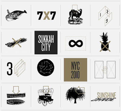
Sukkah City: NYC 2010 comes to Union Square this weekend! This international competition drew entries from all over world with 15 winners being selected to be constructed in Union Square. The 15 re-imagined sukkahs will be voted on by New Yorkers and the winner will remain in Union Square for Sukkot festival.

These 15 winners include designs using all sorts of materials, techniques and concepts. One of my favorites is one that is constructed from a single string...that will be very interesting to see in real life and see if it is structurally sound.

These sukkahs will be in Union Square from dawn to dusk Sunday and Monday so make sure you don't miss it. For more info on Sukkah City, check out the website will all the winners and also every competition entry...there are some pretty hysterical ones.

Book Fair Pencil Wall


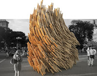
For the Leipzig Book Fair this amazing pencil wall was designed by Johannes Albert and Helmut Stabe. The book fair is one of Europe's largest and this wall was used to display books for Mitteldeutscher Verlag Publishers. The pencils functioned on three levels. They held the wall together, the held the books up on the wall and they also were take-away elements for booth visitors.

I think this is a really creative solution to a fair booth. Its a really great solution to make your product/company stand out among a huge crowd.

Seen in The Cool Hunter article 15,000 Pencils Become a Fair Stand


Monday, September 13, 2010

Barcelona's Subway Upgrade


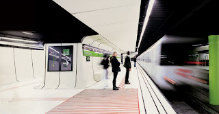
Drassanes Subway Station - Barcelona


Soooooooo bummed this wasn't finished when I lived there!! I suppose it was under construction while we were there. Can you imagine if NYC started doing this to subways stops over a period of time. If Herzog & deMeuron redid the Times Square Station and Zaha Hadid got her hands on Union Square Station. Contemporary architecture at this daily scale would make taking the subway so much better!


Seen on The Cool Hunter in this article.


Designer of 2015 trends

This AIGA article is a pretty interesting read. With the design world constantly changing and the role of a communication designer being redefined almost daily, this article comments of many of these shifts. The role of the designer is no longer to simply create something cool to make a client happy. That may be a small part still, but the scope has increased drastically. The designer of now, or 2015, is a problem solver and a thinker. Shortsightedness and lack of concept are the quickest ways to failure in today's design world.

I found this article to be particularly relevant because when the time came to choose a grad school, the focus on design thinking as a degree program was just beginning to develop. Now, while I chose a different path, one that took me to NYC and not Indianapolis, I think what that school was hitting on is going to be incredibly relevant in the upcoming years. Teaching design thinking rather than design execution is the way to go, and having an intrinsic understanding of what design thinking really is is the only way for a designer to keep themselves from becoming disposable.

The issue of meta-disciplinary designers particularly strikes me. Coming from an architecture background with a packaging minor, I've been labeling myself as MULTI-disciplinary now for a few years, however the term meta-disciplinary was completely new to me. Upon reading what it entails in this article, I was excited to realize that many of my fellow architecture friends had chosen this path by taking anthropology minors. They spent time learning culture traits and understanding people and are now stepping into the real world better equipped to design for a group of people.

I think the designer of 2015 sounds far more interesting that the designer of 15 years ago. While some will not adapt to the new scope of the field, those that do will be able to do more for society than designers ever have before.


Walking for 40 minutes three times a week can make you smarter according to an article on the Kurzweil site. Using this article Ill create a brand platform for Digital Design class.

Saturday, September 11, 2010

The Perfect Pour

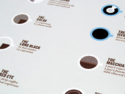
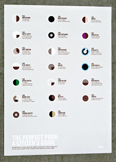
"The Perfect Pour" Poster by Plaid Inc - Thomas Wilder

This is such a fun poster! The designer, Thomas Wilder of Plaid Inc, took his love for coffee and infographics and created this great image. What started as an innocent argument with a barista on how to make a perfect latte ended with something I will now be the proud owner of in 2-3 weeks :)

I think one of the best parts of this poster is the quality of the printing. They were printed offset on Mohawk Superfine, Eggshell, 100 lb text in CMYK. Purchasers are encouraged to take a photo of the poster hanging wherever you so choose as a continuation of the project. I'm excited to see where that goes as well.

Seen on FPO. Theres a ton more amazing pics of the project there.

Wednesday, September 8, 2010

The Wilderness Downtown


If you have Google Chrome, go to the website and do it yourself, its so much better! http://thewildernessdowntown.com/

This video explores the capabilities of Chrome and does lots of things I've never seen before. Before the song starts, the site asks for your home address. During the video, Google imagery is used of the location you type in, showing both aerial views and street panoramas. Its quite impressive.

Also, you are asked to draw a postcard during the song about 3 minutes in. The lines you draw grow tree-like roots and when you connect a shape a wispy sort of grey color appears. The best part is that little birds then fly in and land on the lines you have drawn.

Later in the video, trees are seen growing in Google views (your home imagery if you do it yourself). The postcard you draw is later printed and sold/given out at concerts on seed paper, so that it can, in fact, go trees in your hometown. Pretty elegant connection of all the elements.

Saturday, September 4, 2010

BIG - Bjarke Ingles Group

8H - The 8-House from BIG on Vimeo.


For this blog, I want there to be a wide variety of types of design covered. With all my work, I am striving to attain a multidisciplinary view on the project and to bring all my background experiences with me. With that said, here's an amazing architecture video on the process behind the 8 House by BIG. I'm pretty obsessed with most everything this studio does, from their website to their models and now this. I've never seen anything like this done before. You can not only see the design process for this building, but hear the thought process and see the changes made because of certain considerations. I'm not entirely sure how they even did certain parts of the video, but I think its pretty great.

Seen in the ArchDaily article called "In Progress: 8 House/BIG" by David Basulto.

Stranger Than Fiction Intro


This intro sequence is probably one of my all time favorites, ever. The overlay of graphics on video functions as essentially moving infographics. Since I am focusing on information graphics in my thesis, these sorts of visuals really blow my mind. I'm hoping to learn enough basic digital design skills to be able to pursue this sort of imagery somewhere down the line. For now, I'll drool over other people's amazing skills.

Why didn't I know about this?!


On August 18, 2010 the Standard Hotel NYC, an anchor of The Highline and one of my personal favorite buildings in the city, was transformed into an amazing light show. The installation, funded by Target, was created by Mother NY & LEGS. LEGS is the studio that created the shockingly strange, and recently nominated, music video for Dog Days are Over by Florence + the Machine
http://www.youtube.com/watch?v=iWOyfLBYtuU&feature=related

The event was called the Kaleidoscopic Fashion Spectacular and Target went the distance in my opinion by handing out 1500 binoculars and also setting up a toll free number so that you could hear the music if you watched the show from far away...genius.

I think this is an extremely success instance of many design fields merging together to create something awesome. It reminds of the Blinkenlights exhibit from Berlin, but because I've spent so much time on the High Line, I'm even more drawn to this one. Hopefully The Standard will continue to bring media attention to the High Line area, which just so happens to be my one of my favorite parts of NYC.


Oh and the video is pretty long, so if you don't watch the whole thing...I recommend the first few minutes and then around 7:35 in and also 9:35 in.

Based on an article by Matt Lambert called "LEGS & Mother Take Over The Standard NYC" on motionographer.com
Related Posts Plugin for WordPress, Blogger...