Wednesday, October 27, 2010

PIXMA Sound Sculpture


Canon Pixma: Bringing colour to life from Dentsu London on Vimeo.

This Dentsu London studio just absolutely blew me away. This video is incredible and the concept behind this is brilliant. To rejuvenate the brand for Canon's PIXMA printer, Dentsu took bits of paint on a stretched membrane, hit it with some sound and created some pretty amazing stuff. The video shows the whole process and some video of the paint actually moving slowly in time. Absolutely stunning.

If you do check out Dentsu London's website - make sure to check out the people page. A brilliant way to show a bit of each employee's personality :)

See in Fast & Company Design

Tuesday, October 26, 2010

AAKKOSET - I want one!

AAKKOSET by Kayiwa


The
AAKKOSET bookshelf was designed by Kayiwa, a designer originally from Uganda, now practicing in Helsinki. The bookshelf itself can be used for books, magazines, objects or just as a room divider. It comes in black, blue, green, orange, red, violet, white and yellow


AND I WANT ONE!

Its available on his website for purchase for a mere 15,092 euro which comes to about $21,000. I think Ill have to just dream of this one - or make my own version :)

Meet Daniela


MEET DANIELA

A data visualization exploring a day in the life of New Yorker - Daniela - and how much walking she does. The video is for WalkSmart, a new product I'm developing that will help people track how much they're walking, compare their walking with their friends' walking habits, and educate people on how walking increases brain connections, keeps your brain healthier and reduces the risk of dementia in the elderly.

Still in its early stages - any feedback is welcome :)

I don't recommend watching it full screen currently because the file size is too small and its just a blurry mess. Later iterations will be bigger.

Wednesday, October 20, 2010

World Cup 2010 Twitter Replay


World Cup Twitter Replay
See what people were tweeting during each match of the World Cup as it was going on. Click on each game and see how the tweets changed during the high speed time lapse. Major moments in the game like goals and red card
s are also denoted along the time. This is are really cool idea :)

Designed by Martin Shuttleworth, Mark McCormick, Christine Oliver, Lisa Villani and Alastair Dant for guardian.co.uk

Wednesday, October 13, 2010

Virtual Shoe Museum


The Virtual Shoe Museum is a showcase of some of the strangest and most creative shoes ever made. There are shoes made of every conceivable material, for all sorts of uses ranging from early concepts to completely finalized shoes. The first shoe above is the Invisible Shoe by Andreia Chaves using a mirrored material on a faceted surface that picks up all of its surroundings. The shoe below it is the Mojito Shoe by Julian Hakes.

If you have some time to kill, need a good laugh, or just want to see something that looks absolutely crazy - check out the Virtual Shoe Museum.

Tuesday, October 12, 2010

Monday, October 11, 2010

Journalism in the Age of Data: A Video Report on Data Visualization by Geoff McGhee

Journalism in the Age of Data by Geoff McGhee

Journalism in the Age of Data from Geoff McGhee on Vimeo.

This is quite possibly the most valuable find in the thesis research so far. It is a spectacular video on the state of news design and information design. The video was put together by Geoff McGhee and I have to say, the flash version of the video has blown me away. For each of the 8 sections, there are tabs and as a new speaker or topic comes up, tabs with relevant information appear along the bottom. If you have an hour to spare, I HIGHLY recommend taking a peek at this video. Each section is also available as a podcast.

Tuesday, October 5, 2010

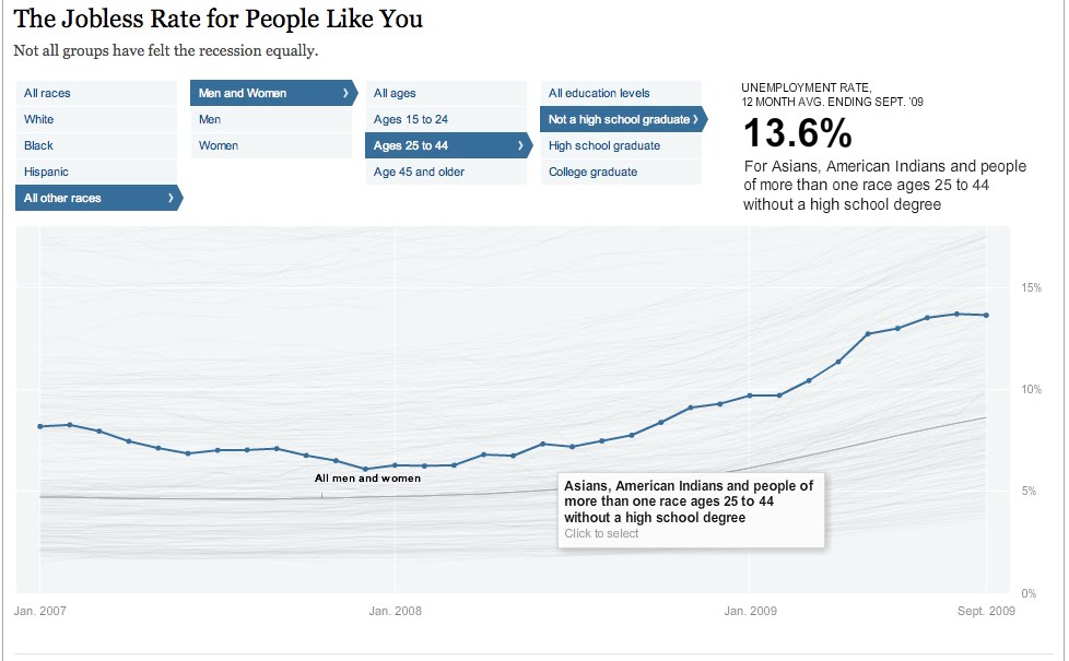
Jobless rate for different demographics


The Jobless Rate for People Like You
A New York Times Data Visualization

Think this economy sucks for everybody...well you're right, but it sure does seem to suck more for some people than others. This filterable visualization allows you to see all of the trends of unemployment from early 2007 to late 2009. You can see them all as whole or you can select certain people groups to who seems to have the worst deal. Can you guess who has the highest unemployment rate? The lowest? The highest is black males ages 15-24 with no high school education at 48.5% - HOLY COW! The lowest - my guess would have been a middle aged white guy right? Welllll ladies, its actually a white female ages 25-44 with a college degree at a mere 3.6%. I think this is a very interesting way to see a lot or just a little bit of data and really be able to compare one with lots of others simultaneously.


Thursday, September 30, 2010

Renaming architecture

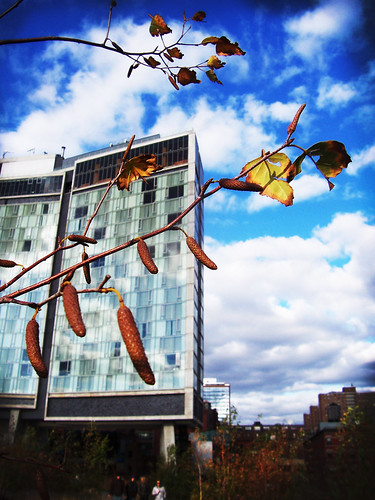
Standard Hotel

Polshek Partnership, creators of great buildings like The Standard Hotel(2008) above, the William J. Clinton Presidential Center (2004), and the Rose Center for Earth and Space(2002) at the American Museum of Natural History recently changed their name to Ennead. The more ambigous name follows a popular trend to steer away from the "white male architect" leading a firm, to a more collective environment. Polshek is also looking to retire and wanted to remove his name from such a prominent position.

This NY Times article mentions other firms who have done the same thing including Hugh Hardy Architects to H3 and Fox & Fowle to FXFowle. These older firms are following in the footsteps of younger firms, who created names like these from the start. Firms like OMA, Pentagram and Morphosis all have big name designers in them, but aren't reliant on that one designer's name should anything change.

Its certainly an interesting topic, especially with the generation of starchitects reaching very old age, and almost all their firms simply being named after themselves. The question becomes, can a firm continue on if its namesakes passes away or wants to retire? In the next 10 years, I think name changes like Polshek to Ennead will become very common. The design understanding and firm reputation does not need to be lost just because the namesake is no longer an integral part.

Wednesday, September 29, 2010

The Beauty of Data Visualization


This is a talk by David McCandless, author of Visual Miscellaneum, at TEDGlobal 2010 this July. He's is journalist turned designer and in his talk he discusses some great concepts. He mentions how incredibly vital context is when creating and understanding an infographic. I think that is so true, especially with all of the infographics now used in the media. We think we're better understanding an issue or problem, but if the proper context is not included, we could be totally off the mark.

McCandless says he loves finding hidden patterns within data. I could not agree more and I think thats a huge reason for my daily life documenting project (ongoing for 637 days as of today, Sept 29). The revealing of hidden trends and patterns through data design is definitely one of the best parts.

Here is the original video from TED. TED = awesome. Also if you're as enamored with a few of his comments as I was...surprise, TED has a Interactive Transcript feature that allows you to skip around to any specific moment in the presentation by phrase.
Related Posts Plugin for WordPress, Blogger...