
The Jobless Rate for People Like You
A New York Times Data Visualization
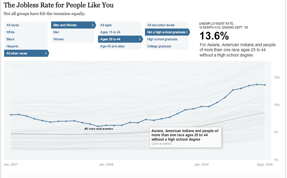
Think this economy sucks for everybody...well you're right, but it sure does seem to suck more for some people than others. This filterable visualization allows you to see all of the trends of unemployment from early 2007 to late 2009. You can see them all as whole or you can select certain people groups to who seems to have the worst deal. Can you guess who has the highest unemployment rate? The lowest? The highest is black males ages 15-24 with no high school education at 48.5% - HOLY COW! The lowest - my guess would have been a middle aged white guy right? Welllll ladies, its actually a white female ages 25-44 with a college degree at a mere 3.6%. I think this is a very interesting way to see a lot or just a little bit of data and really be able to compare one with lots of others simultaneously.


This is really interesting! Thanks for sharing.
ReplyDelete