Sunday, February 27, 2011

The Whale Hunt

Prepare to be blown away.


Reminding me of the flickr thread showing all the people who sat across from Marina Abramovic at her recent MoMA exhibit, this is a piece that, once you start looking, its incredibly difficult to step away.

The Whale Hunt is a beautiful project by Jonathan Harris - storyteller, visual artist, computer scientist, anthropologist, data voyeur, photographer, digital anthropologist, interviewer, and designer - that really pushes storytelling to a new level. Harris is the designer behind We Feel Fine and many other unique online story-telling experiments of sorts.


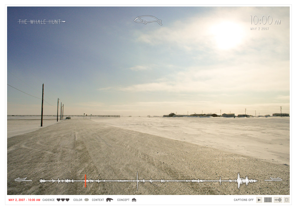
Here's Jonathan's description of the project -
"In May 2007, I spent nine days living with a family of Inupiat Eskimos in Barrow, Alaska, the northernmost settlement in the United States. I documented their traditional whale hunt with a plodding sequence of 3,214 photographs, taken at five-minute intervals for seven days, and at even higher frequencies in moments of high adrenaline. This established a constant “photographic heartbeat” that more or less matched the changing pace of my own heartbeat, and which recorded every moment of the hunt. I then developed a framework for experiencing this story, allowing the viewer to rearrange the photographic elements of the story to extract multiple sub-stories focused around different people, places, topics, and other variables."

Here's the ways you can see the photos, and then once you begin to click through, you can change the constraints of what you're viewing - only pictures in Barrow Alaska, about so and so, doing just this, etc etc.

Explore it...and give yourself a little time to do so.


Thursday, February 24, 2011

Red Eye

Christoph Niemann...your work is brilliant. This is the THIRD time I've really enjoyed something he designed before realizing it was indeed him who had created it :)

A previous cookie dough post and the wonderful I Lego NY book (sitting happily on my coffee table at the moment, as all recent Amazon deliveries tend to do) can also be attributed to him.

Red Eye, a "visual diary documenting a flight from New York to Berlin (with a layover in London)" is hysterical, especially for anyone who has dealt with lots of air travel.

I left a few images out, so see the whole thing on the original NY Times post.


Tuesday, February 22, 2011

Stunning

Simple. Beautiful. Stunning.

This is like perfection to my OCD, organization and mapping obsessed design brain.


I love the differences between the right side layout of these two cities. The New York City grid I love (and appreciate daily) becomes so very straightforward and dull when you restructure it like this, where the intricacies of the Paris city plan become far more evident and endearing. Its hard to find much evidence of any right angles at all.


These and many other maps were designed by Armelle Caron, a French artist and designer. The series is entitled Anagrammes graphiques de plans de villes and includes seven cities - Berlin, Istanbul, New York, Tamarac, Paris, Le Havre & Montpellier. Also check out some of his other work.

Saturday, February 5, 2011

Brought to you by the letters S & W


Here's the follow up to my earlier post showing a sneak peek of cotton ball sheep. This is a short and quite silly stop motion I did to try to illustrate (in a very small part) a bit of Newtons First Law of Motion (as per assignment instruction) while making it mildly education just for fun :)

The idea is that falling letters are used to introduce all of the narrative elements. Using this same concept, two more videos will be forthcoming :)

Here's the photoshoot set up - highly technical as you can tell haha I didnt even have a tripod so I had to tape my camera to stack of moleskines - oy


Here's the shoot from a little further back where you can see how the cloud was actually suspended from, yes, dental floss taped to the lights. Again, highly technical right here haha. It refused to stop spinning, so I had to take each shot only when the cloud faced the right direction.


This is one of my stills for the video, before the post processing I did to add the eyes and emotions.

Tuesday, February 1, 2011

"Light Hearted"

The winner for this year's Time Square Valentine design competition is "Light Hearted" by Lauren Crahan and John Hartmann, of Brooklyn-based Freecell.

The heart will be in Duffy Square from Feb 10-20 and it depends entirely on volunteers to actually work. The heart is composed of 6 pairs of metal rings held in the air by volunteers and any extra Time Square visitors who want to participate.

Freecell beat out finalists BIG (Bjarke Ingles Group) - City Pulse & Marc Fornes Design - Fluttering Hearts for this year's Time Square Valentine. You can see their entries on the TS Valentine Competition website.

I certainly hope enough people volunteer to keep it in the air the whole time! If you're interested in volunteering, you can sign up on the website - www.lighthearted.us


Related Posts Plugin for WordPress, Blogger...