Showing posts with label Information Design. Show all posts

Friday, June 24, 2011

Color Codification Dot Drawings

Came across these today and fell in love - such a great combination of information design and fine art. I WANT ONE! :) Artist Lauren DiCiocco created this series and her explanation of the project is below -

"I call this body of work my "color codification dot drawings." To make each painting, I lay a sheet of frosted mylar over a magazine page. I assign a color to every letter (numbers are shades of grayscale) and apply tiny dots of paint over every character on the page according to my color-code. Making the paintings is a lot like solving a cryptogram and the result is a legible blur of dots in the form of the article’s layout, a kind of Braille for the color-inclined."

A few are for sale via 20x20.


Monday, May 2, 2011

BP Oil Spill

This is an interesting animation of the BP oil spill data called Oil'd by Chris Harmon. I'm a huge fan of infographic videos anyways, but I think this was does a really good job adding helpful context to these numbers.

Its one of Fast Co's Daily Infographics - an excellent source of high quality and content data visualizations.

Oil'd from Chris Harmon on Vimeo.

Tuesday, February 22, 2011

Stunning

Simple. Beautiful. Stunning.

This is like perfection to my OCD, organization and mapping obsessed design brain.


I love the differences between the right side layout of these two cities. The New York City grid I love (and appreciate daily) becomes so very straightforward and dull when you restructure it like this, where the intricacies of the Paris city plan become far more evident and endearing. Its hard to find much evidence of any right angles at all.


These and many other maps were designed by Armelle Caron, a French artist and designer. The series is entitled Anagrammes graphiques de plans de villes and includes seven cities - Berlin, Istanbul, New York, Tamarac, Paris, Le Havre & Montpellier. Also check out some of his other work.

Thursday, January 27, 2011

How Would You Like Your Graphic Design?

This is hysterical - and so so so true! I wish I could just email this to potential clients so they can decide what they want and we can all be on the same page from the get go :)


Designed by Colin Harman and available for purchase here for $28.50

Via coolinfographics.com

Tuesday, January 18, 2011

Should I Work For Free


Check out this fun decision flowchart (seem to be all the rage these days) by Jessica Hische, designer of beautiful typography, on "Should I work for free?"

She gives some pretty fun scenarios and as a desperate grad student, I've been in way too many of them haha

Also, not to be missed, she did it in html so that you can translate it using Google Translate into like a million languages. Its also available for download in English as a jpg.

Via Daniel & Cool Infographics

Tuesday, November 2, 2010

Roman Ondák is amazing


Roman Ondák is creating another living infographic at the temporary stedelijk. He's a Slovakian artist plotting visitors’ heights whose mean will become increasingly apparent over the four months of the exhibition. Ondák created "Measuring the Universe" at the Museum of Modern Art last year and gave visitors a similar experience. Attendants measure visitors by height, first name and date. What started as boring white walls quickly becomes a visualization of aggregated data.

Since I'm doing my thesis on data visualization, its always so fun to see how far outside of the box one can go to show a visualization. Instead of a printed or even interactive graphic, bound by paper edges or screen edges, Ondák has created a visualization you can be a part of. With your participation, it will not look the same, and without any participation, it could not exist at all. How fantastic.


Article and pictures see on DesignBoom

Tuesday, October 26, 2010

Meet Daniela


MEET DANIELA

A data visualization exploring a day in the life of New Yorker - Daniela - and how much walking she does. The video is for WalkSmart, a new product I'm developing that will help people track how much they're walking, compare their walking with their friends' walking habits, and educate people on how walking increases brain connections, keeps your brain healthier and reduces the risk of dementia in the elderly.

Still in its early stages - any feedback is welcome :)

I don't recommend watching it full screen currently because the file size is too small and its just a blurry mess. Later iterations will be bigger.

Monday, October 11, 2010

Journalism in the Age of Data: A Video Report on Data Visualization by Geoff McGhee

Journalism in the Age of Data by Geoff McGhee

Journalism in the Age of Data from Geoff McGhee on Vimeo.

This is quite possibly the most valuable find in the thesis research so far. It is a spectacular video on the state of news design and information design. The video was put together by Geoff McGhee and I have to say, the flash version of the video has blown me away. For each of the 8 sections, there are tabs and as a new speaker or topic comes up, tabs with relevant information appear along the bottom. If you have an hour to spare, I HIGHLY recommend taking a peek at this video. Each section is also available as a podcast.

Tuesday, October 5, 2010

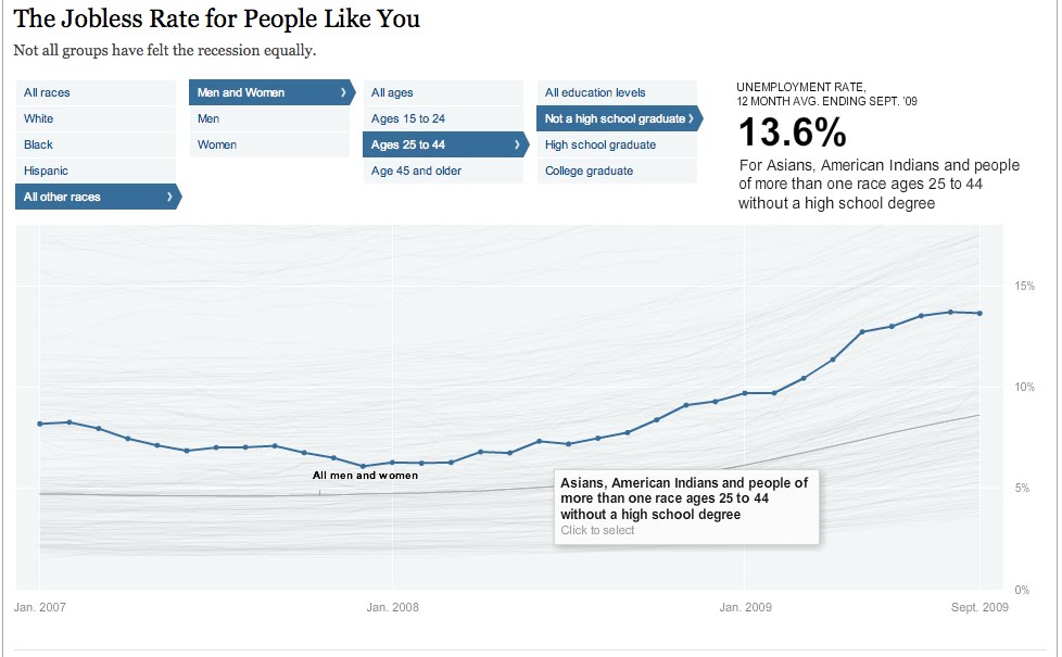
Jobless rate for different demographics


The Jobless Rate for People Like You
A New York Times Data Visualization

Think this economy sucks for everybody...well you're right, but it sure does seem to suck more for some people than others. This filterable visualization allows you to see all of the trends of unemployment from early 2007 to late 2009. You can see them all as whole or you can select certain people groups to who seems to have the worst deal. Can you guess who has the highest unemployment rate? The lowest? The highest is black males ages 15-24 with no high school education at 48.5% - HOLY COW! The lowest - my guess would have been a middle aged white guy right? Welllll ladies, its actually a white female ages 25-44 with a college degree at a mere 3.6%. I think this is a very interesting way to see a lot or just a little bit of data and really be able to compare one with lots of others simultaneously.


Wednesday, September 29, 2010

The Beauty of Data Visualization


This is a talk by David McCandless, author of Visual Miscellaneum, at TEDGlobal 2010 this July. He's is journalist turned designer and in his talk he discusses some great concepts. He mentions how incredibly vital context is when creating and understanding an infographic. I think that is so true, especially with all of the infographics now used in the media. We think we're better understanding an issue or problem, but if the proper context is not included, we could be totally off the mark.

McCandless says he loves finding hidden patterns within data. I could not agree more and I think thats a huge reason for my daily life documenting project (ongoing for 637 days as of today, Sept 29). The revealing of hidden trends and patterns through data design is definitely one of the best parts.

Here is the original video from TED. TED = awesome. Also if you're as enamored with a few of his comments as I was...surprise, TED has a Interactive Transcript feature that allows you to skip around to any specific moment in the presentation by phrase.
Related Posts Plugin for WordPress, Blogger...