Showing posts with label data visualization. Show all posts

Monday, May 2, 2011

BP Oil Spill

This is an interesting animation of the BP oil spill data called Oil'd by Chris Harmon. I'm a huge fan of infographic videos anyways, but I think this was does a really good job adding helpful context to these numbers.

Its one of Fast Co's Daily Infographics - an excellent source of high quality and content data visualizations.

Oil'd from Chris Harmon on Vimeo.

Sunday, February 27, 2011

The Whale Hunt

Prepare to be blown away.


Reminding me of the flickr thread showing all the people who sat across from Marina Abramovic at her recent MoMA exhibit, this is a piece that, once you start looking, its incredibly difficult to step away.

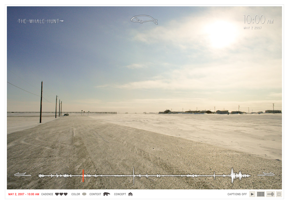
The Whale Hunt is a beautiful project by Jonathan Harris - storyteller, visual artist, computer scientist, anthropologist, data voyeur, photographer, digital anthropologist, interviewer, and designer - that really pushes storytelling to a new level. Harris is the designer behind We Feel Fine and many other unique online story-telling experiments of sorts.


Here's Jonathan's description of the project -
"In May 2007, I spent nine days living with a family of Inupiat Eskimos in Barrow, Alaska, the northernmost settlement in the United States. I documented their traditional whale hunt with a plodding sequence of 3,214 photographs, taken at five-minute intervals for seven days, and at even higher frequencies in moments of high adrenaline. This established a constant “photographic heartbeat” that more or less matched the changing pace of my own heartbeat, and which recorded every moment of the hunt. I then developed a framework for experiencing this story, allowing the viewer to rearrange the photographic elements of the story to extract multiple sub-stories focused around different people, places, topics, and other variables."

Here's the ways you can see the photos, and then once you begin to click through, you can change the constraints of what you're viewing - only pictures in Barrow Alaska, about so and so, doing just this, etc etc.

Explore it...and give yourself a little time to do so.


Thursday, February 24, 2011

Red Eye

Christoph Niemann...your work is brilliant. This is the THIRD time I've really enjoyed something he designed before realizing it was indeed him who had created it :)

A previous cookie dough post and the wonderful I Lego NY book (sitting happily on my coffee table at the moment, as all recent Amazon deliveries tend to do) can also be attributed to him.

Red Eye, a "visual diary documenting a flight from New York to Berlin (with a layover in London)" is hysterical, especially for anyone who has dealt with lots of air travel.

I left a few images out, so see the whole thing on the original NY Times post.


Tuesday, February 22, 2011

Stunning

Simple. Beautiful. Stunning.

This is like perfection to my OCD, organization and mapping obsessed design brain.


I love the differences between the right side layout of these two cities. The New York City grid I love (and appreciate daily) becomes so very straightforward and dull when you restructure it like this, where the intricacies of the Paris city plan become far more evident and endearing. Its hard to find much evidence of any right angles at all.


These and many other maps were designed by Armelle Caron, a French artist and designer. The series is entitled Anagrammes graphiques de plans de villes and includes seven cities - Berlin, Istanbul, New York, Tamarac, Paris, Le Havre & Montpellier. Also check out some of his other work.

Sunday, January 2, 2011

If you're not using social media...

you should be :)

Fun visualization video of social media stats by DBA Worldwide

A Day in the Life of Social Media from DBA Worldwide on Vimeo.


**Shameless plug for my company**

Check out The Spark Group for some amazing social media marketing

Wednesday, December 8, 2010

Lauren Manning Design Work

Hi my name is Lauren Manning and here's a bit of my work in a temporary portfolio while my full site is under construction. here is my new portfolio site.

I am a designer, thinker and storyteller interested in constructing brand stories through design systems, solving problems with collaborative thinking and innovative solutions, and creating a narrative from raw data to communicate effectively through visualization.

Contact: lmanning729@gmail.com

For more information on any project, my resume or recommendations, feel free to email me.


Data Communication/Visualization
“It’s like comparing apples to oranges.” This phrase is the best way to describe the current state of data visualizations. For the designer, its easy to find good visualizations and bad ones, but how to apply the successful elements of particular designs to one’s own data set starts to get a little more complicated. Data sets vary tremendously, so one man’s brilliant solution can be another’s complete failure. Instead of seeing many excellent visualizations of all different data sets, what if you could see tons of visualizations of the same data set? What new comparisons, knowledge and structure might be developed from this?

Using a data set created from two years of meticulous life documenting, I visualized one point of data – food consumed – over forty ways. Exploring various methods, techniques, styles, degrees of complexity, degrees of additional context and many other elements, a true “apples to apples” comparison has emerged.


The project has been featured on datavisualization.ch and infosthetics.com.


The Curiosity Project
The Curiosity Project is an effort to bridge the very unique gap between the print and digital worlds. By combining QR codes (that work!), a blog, hand making and pure curiosity the hope is to restructure the way we interact with both print and digital media.


Be Versatile
Part of a self promotion piece, this project showcases multiple hand-crafted techniques to create various letterforms spelling the phrase “Be Versatile.” The making of all of the letters was videotaped and the one hundred hours of footage compressed into a two minute high speed time lapse. The video shows the “proof” of the making process while the phrase itself it meant to inspire designers to use methods beyond the computer to explore ways of communicating.


Wednesday, November 3, 2010

Save The Words!

Launched by the Oxford English Dictionary, Save the Words is a lighthearted project "to save forgotten words from obsolescence." Users can go to the website just to learn about all these forgotten words rarely used in everyday conversation. They've been "designed" differently and in vibrant colors, making the interaction fun, although there are a lot of typefaces on there that induce a bit of a gag reflex haha. You can just browse through the words to stock up for the day, or a particularly competitive night of Scrabble, or you can even ADOPT A WORD! How fun! You register and then pledge that if you adopt the word, you will try to use it in everyday conversation to bring it back from the dead.

Seen first on GOOD.


Tuesday, November 2, 2010

Roman Ondák is amazing


Roman Ondák is creating another living infographic at the temporary stedelijk. He's a Slovakian artist plotting visitors’ heights whose mean will become increasingly apparent over the four months of the exhibition. Ondák created "Measuring the Universe" at the Museum of Modern Art last year and gave visitors a similar experience. Attendants measure visitors by height, first name and date. What started as boring white walls quickly becomes a visualization of aggregated data.

Since I'm doing my thesis on data visualization, its always so fun to see how far outside of the box one can go to show a visualization. Instead of a printed or even interactive graphic, bound by paper edges or screen edges, Ondák has created a visualization you can be a part of. With your participation, it will not look the same, and without any participation, it could not exist at all. How fantastic.


Article and pictures see on DesignBoom

Wednesday, October 20, 2010

World Cup 2010 Twitter Replay


World Cup Twitter Replay
See what people were tweeting during each match of the World Cup as it was going on. Click on each game and see how the tweets changed during the high speed time lapse. Major moments in the game like goals and red card
s are also denoted along the time. This is are really cool idea :)

Designed by Martin Shuttleworth, Mark McCormick, Christine Oliver, Lisa Villani and Alastair Dant for guardian.co.uk

Tuesday, October 5, 2010

Jobless rate for different demographics


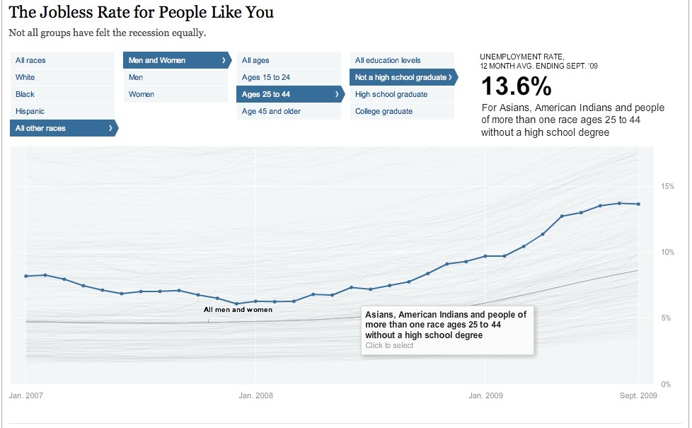
The Jobless Rate for People Like You
A New York Times Data Visualization

Think this economy sucks for everybody...well you're right, but it sure does seem to suck more for some people than others. This filterable visualization allows you to see all of the trends of unemployment from early 2007 to late 2009. You can see them all as whole or you can select certain people groups to who seems to have the worst deal. Can you guess who has the highest unemployment rate? The lowest? The highest is black males ages 15-24 with no high school education at 48.5% - HOLY COW! The lowest - my guess would have been a middle aged white guy right? Welllll ladies, its actually a white female ages 25-44 with a college degree at a mere 3.6%. I think this is a very interesting way to see a lot or just a little bit of data and really be able to compare one with lots of others simultaneously.


Related Posts Plugin for WordPress, Blogger...