Showing posts with label Digital Design. Show all posts

Sunday, February 27, 2011

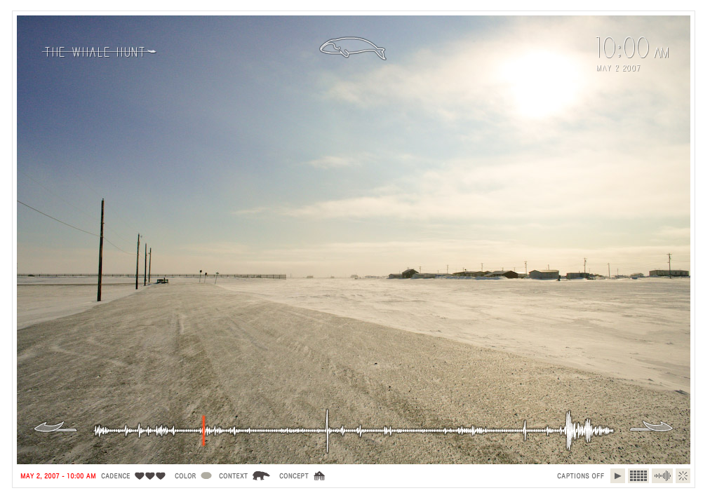
The Whale Hunt

Prepare to be blown away.


Reminding me of the flickr thread showing all the people who sat across from Marina Abramovic at her recent MoMA exhibit, this is a piece that, once you start looking, its incredibly difficult to step away.

The Whale Hunt is a beautiful project by Jonathan Harris - storyteller, visual artist, computer scientist, anthropologist, data voyeur, photographer, digital anthropologist, interviewer, and designer - that really pushes storytelling to a new level. Harris is the designer behind We Feel Fine and many other unique online story-telling experiments of sorts.


Here's Jonathan's description of the project -
"In May 2007, I spent nine days living with a family of Inupiat Eskimos in Barrow, Alaska, the northernmost settlement in the United States. I documented their traditional whale hunt with a plodding sequence of 3,214 photographs, taken at five-minute intervals for seven days, and at even higher frequencies in moments of high adrenaline. This established a constant “photographic heartbeat” that more or less matched the changing pace of my own heartbeat, and which recorded every moment of the hunt. I then developed a framework for experiencing this story, allowing the viewer to rearrange the photographic elements of the story to extract multiple sub-stories focused around different people, places, topics, and other variables."

Here's the ways you can see the photos, and then once you begin to click through, you can change the constraints of what you're viewing - only pictures in Barrow Alaska, about so and so, doing just this, etc etc.

Explore it...and give yourself a little time to do so.


Sunday, January 2, 2011

If you're not using social media...

you should be :)

Fun visualization video of social media stats by DBA Worldwide

A Day in the Life of Social Media from DBA Worldwide on Vimeo.


**Shameless plug for my company**

Check out The Spark Group for some amazing social media marketing

Wednesday, November 3, 2010

Out My Window


Link


Out My Window is part of the Highrise Project - "Highrise is a multi-year, multi-media, collaborative documentary project about the human experience in global vertical suburbs."

For this multi part project Out My Window is just one little bit, but boy is it a good bit. To show different lives, living conditions and experiences, the Out My Window website shows a montaged building with different windows showing peeks of apartment interiors. Clicking on one brings you, the viewer, right into the middle of their living room. Shot in a 360 degree view, you can pan around the space, see what this person's life is like, and experience their view out their window. Going further, you can learn about each person by clicking on different elements and hearing a narrative.

There is something so real and so genuine about the way these apartments are shown. If it were just some pictures, that would not have much affect on me at all, but because of the 360 view, you really feel like you are there. You're given the chance to step into an apartment in Prague and "meet" the people who live there - what a unique experience.

Major major props to Alison for sharing this with me :)

Fluid Vase


A brilliant combination in 3D modeling and visualization with 3D printing creates these one-of-a-kind splash vases. Created by Supabold, they have partnered with i.materialise to allow customers to digitally create their own simulated splash, choose the best moment and have it turned into a vase. The i.materialise website says about the project:

“Supabold’s Fluid Vase is a moment frozen in time. Water rushes in splashing, filling the void. The splashes are physics & poetry.

You can now select a water drop, position it and watch the water flow. Choose the most beautiful instant and forever capture it. 3D printing takes this moment and turns it into your unique vase.”

These vases are incredible. If they didnt cost $600, I'd be making myself one right now :)

See on FastCoDesign.

Save The Words!

Launched by the Oxford English Dictionary, Save the Words is a lighthearted project "to save forgotten words from obsolescence." Users can go to the website just to learn about all these forgotten words rarely used in everyday conversation. They've been "designed" differently and in vibrant colors, making the interaction fun, although there are a lot of typefaces on there that induce a bit of a gag reflex haha. You can just browse through the words to stock up for the day, or a particularly competitive night of Scrabble, or you can even ADOPT A WORD! How fun! You register and then pledge that if you adopt the word, you will try to use it in everyday conversation to bring it back from the dead.

Seen first on GOOD.


Monday, November 1, 2010

WalkSmart Update

OK Go - End Love


More amazing work from OK Go and more amazing stop motion. Love this video! At the end, when all the people from the park get involved, theres some really creative ideas there. I love the mass moving at high speed with the band barely moving - so great!

Thanks to Charles for sharing!

3Oh!3 Double Vision


No special effects, this 3Oh!3 Double Vision music video brilliantly mimics scrolling down a website. Theres "embedded videos" throughout the site that when clicked come to life and even banner ads. Such a creative idea! Love it!

Here's the Behind the Scenes making of the video. Would have loved to see this set!

Wednesday, October 27, 2010

PIXMA Sound Sculpture


Canon Pixma: Bringing colour to life from Dentsu London on Vimeo.

This Dentsu London studio just absolutely blew me away. This video is incredible and the concept behind this is brilliant. To rejuvenate the brand for Canon's PIXMA printer, Dentsu took bits of paint on a stretched membrane, hit it with some sound and created some pretty amazing stuff. The video shows the whole process and some video of the paint actually moving slowly in time. Absolutely stunning.

If you do check out Dentsu London's website - make sure to check out the people page. A brilliant way to show a bit of each employee's personality :)

See in Fast & Company Design

Tuesday, October 26, 2010

Meet Daniela


MEET DANIELA

A data visualization exploring a day in the life of New Yorker - Daniela - and how much walking she does. The video is for WalkSmart, a new product I'm developing that will help people track how much they're walking, compare their walking with their friends' walking habits, and educate people on how walking increases brain connections, keeps your brain healthier and reduces the risk of dementia in the elderly.

Still in its early stages - any feedback is welcome :)

I don't recommend watching it full screen currently because the file size is too small and its just a blurry mess. Later iterations will be bigger.

Wednesday, October 20, 2010

World Cup 2010 Twitter Replay


World Cup Twitter Replay
See what people were tweeting during each match of the World Cup as it was going on. Click on each game and see how the tweets changed during the high speed time lapse. Major moments in the game like goals and red card
s are also denoted along the time. This is are really cool idea :)

Designed by Martin Shuttleworth, Mark McCormick, Christine Oliver, Lisa Villani and Alastair Dant for guardian.co.uk

Monday, October 11, 2010

Journalism in the Age of Data: A Video Report on Data Visualization by Geoff McGhee

Journalism in the Age of Data by Geoff McGhee

Journalism in the Age of Data from Geoff McGhee on Vimeo.

This is quite possibly the most valuable find in the thesis research so far. It is a spectacular video on the state of news design and information design. The video was put together by Geoff McGhee and I have to say, the flash version of the video has blown me away. For each of the 8 sections, there are tabs and as a new speaker or topic comes up, tabs with relevant information appear along the bottom. If you have an hour to spare, I HIGHLY recommend taking a peek at this video. Each section is also available as a podcast.

Tuesday, October 5, 2010

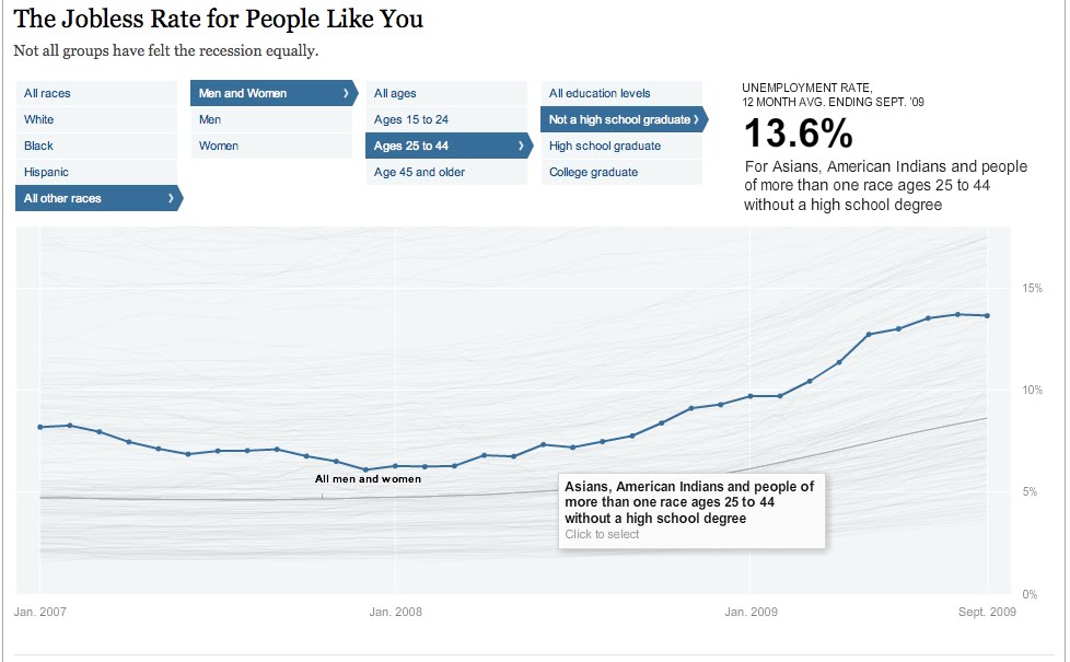
Jobless rate for different demographics


The Jobless Rate for People Like You
A New York Times Data Visualization

Think this economy sucks for everybody...well you're right, but it sure does seem to suck more for some people than others. This filterable visualization allows you to see all of the trends of unemployment from early 2007 to late 2009. You can see them all as whole or you can select certain people groups to who seems to have the worst deal. Can you guess who has the highest unemployment rate? The lowest? The highest is black males ages 15-24 with no high school education at 48.5% - HOLY COW! The lowest - my guess would have been a middle aged white guy right? Welllll ladies, its actually a white female ages 25-44 with a college degree at a mere 3.6%. I think this is a very interesting way to see a lot or just a little bit of data and really be able to compare one with lots of others simultaneously.


Sunday, September 26, 2010

Digital Fitness Trainers


In this NY Times article, author Anne Eisenberg discusses some of the recent technologies that have come on the market to help people stick to a fitness plan. If you are competitive and just need a record of your journey, theres gadgets that will record of your weight, heart rates or distance walked and even publish them to your twitter feed (for the very brave). Or for those who need more motivation, there is a watch that will tell you that its "Exercise day" and say "Good workout" once you've finished. Thats not enough for you? Well then theres a new robot developed by an MIT grad that will "look" you in the eye and help you keep on track with diet advice.

Another popular means of keeping track of working out are applications for iPhones/iPods/Androids. Websites likes RunKeeper and DailyBurn help you keep track of how far you've run, your heartrate and even help you find good routes to use depending on what type of fitness you're doing - run, walk, bike, hike etc.

Based on my brand platform "Walking makes you smarter" I will be developing something more along the lines of RunKeeper and DailyBurn but less for fitness nuts and more for old folks. Just 40 mintues a day, 3 times a week can improve brain connections and therefore, brain function in people over 60. I hope to use some of the concepts that RunKeeper and DailyBurn have established but also incorporate a relational aspect, so that you can "go for a walk" with an old friend who lives 2000 miles away by using the app and keeping up with each other.

Related Posts Plugin for WordPress, Blogger...